
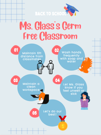
For my assignment this week, I decided to create a poster that outlines some suggestions for students to follow to ensure the classroom stays clean, safe and germ-free. I used Canva to create my poster. The website provided inspiring templates to bring my ideas to life. In addition, the templates were incredibly user-friendly and allowed me to cater them towards my vision, allowing me to change the colours, photos, font and message. I will definitely save this resource and use it later in my career when I become a teacher!
When creating my poster, I decided to use soft and friendly colours, creating a message that is genuine and caring towards my students. I chose a big font to allow the important messages and title to stand out. I referenced the Multimedia Principle to create a helpful poster that successfully conveys my message to students about a germ-free classroom. The Multimedia Principle explained by McCues (2020) describes how people learn better when words are accompanied by relevant pictures rather than words presented alone. With this in mind, I accompanied my writing with small relevant pictures, such as hands with soap to represent ‘frequent hand washing with soap.’
Posters are a beneficial tool in the classroom if executed properly. Here is a link to a video that explores potential problems if poorly executed:
Reference:
McCue, R. (2020). Principles of Multimedia Learning—A summary. https://docs.google.com/document/d/1TGVFG_iCc3iSz3aX3j8UC-YC63V__6tKFJQ4FtAsH4o/
Heavily Decorated Classrooms Disrupt Attention and Learning in young Children. (2014). Youtube. Retrieved November 29, 2021, from https://www.youtube.com/watch?v=qt0muSzEd_M&t=228s
Hi Emily,
I really like the poster that you included! It offers a concise and visually appealing way to get your message across. I liked how you tailored this piece to a specific age group by using big texts and soft colours because sometimes when we are working with young students they don’t understand the message that we are trying to get across!!
Hey Emily,
Your poster looks great! I love all of the colours you used. This is a great poster for your classroom. It is easy to read, and simple. This poster is not confusing and gets the message to the readers. Moreover, you designed your poster in an eye-catching way. This poster will catch the eye of young students.
Great job!
Hi Emily,
Thanks for sharing! I liked your poster and think it would be very beneficial to be posted up in a classroom. It is easy to read and attractive to the eye which is perfect for the younger audience it is intended for!